Beyond Design
設計之外
CATEGORY : Book
YEAR : 2024
LANGUAGE : Chinese
PRICE : 588rmb
"Beyond Design" is the first literary work published by the designer He Jianping. The content is mainly composed of essays and is divided into two volumes: "Pain Cannot Be Anesthetized" and "Black Solitude." In the book "Pain Cannot Be Anesthetized," there is a large amount of personal feelings that defy theoretical logic.
The book "Black Solitude" consists of works that the author has designed over the past thirty years. The most in-depth way to observe others' works is to write down the feelings afterward. In "Black Solitude," He Jianping wrote: "Only human emotions are the catalyst for disciplinary progress, even in the calmest writing of design history. Without the assistance of personal emotions, words are like gears without lubricant, accompanied by harsh noise, making them difficult to read and accept. A person who is easily moved possesses the readability for writing."
The book cover is composed of two different textures of off-white paper. The title and the text inside are typeset using two different fonts, combined with the hot stamping process to create a random mottled texture. Due to manual operation, each book is slightly different, giving it a strong personality that breaks away from the classical but presents different states.
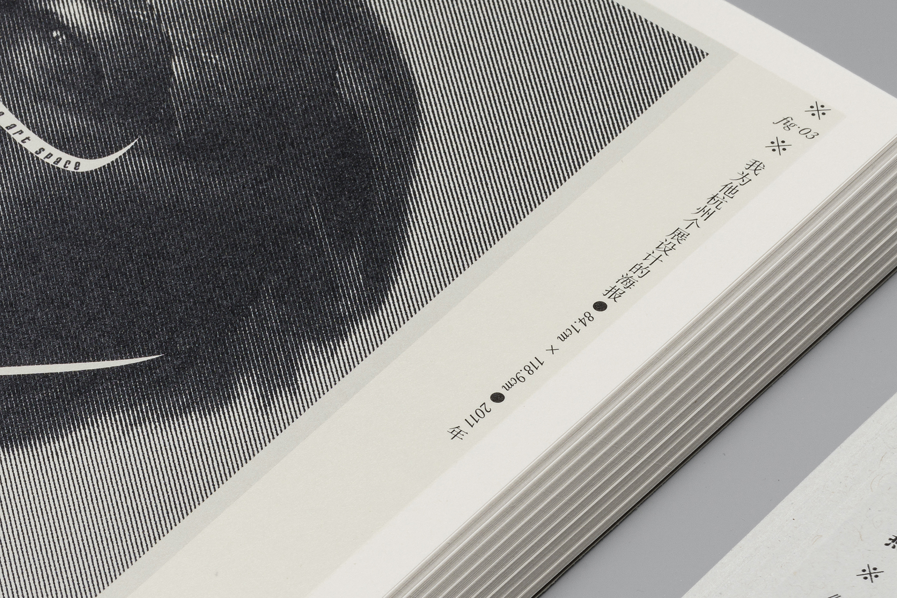
The title of the book is "Beyond Design," and the use of two types of paper and fonts hides the designer's contemplation of boundaries and fusion. In addition, there are faintly printed fixed frames with white spot colors on the inner pages, serving as a constant reminder of the existence of boundaries. However, the text itself wanders between inside and outside the boundaries, much like individuals and their lives.
The layout of the book's content exhibits both the scholarly atmosphere of academic books and a dynamic quality due to the abundance of white space, making reading enjoyable and effortless.
+
這本書是設計師何見平初次出版的文學作品,
內容以隨筆為主,
分為«疼痛,
是無法被麻醉的»和«黑色的孤獨»兩冊。
«疼痛,是無法被麻醉的»這本書中,
存在了大量這種不存在理論邏輯的、私人的感受。
«黑色的孤獨»這本書,
是作者近三十年來設計的習作本。
觀察別人的作品最深入的方法,
就是寫下感受後的文字。
«黑色的孤獨»中寫道:
“只有人的情感才是學科進步的催化劑,
哪怕最冷靜的設計歷史書寫。
沒有個人的情感助力,文字就像失去潤滑劑的齒輪,
伴隨刺耳的雜音,變得難以被閱讀和接納。
壹個容易被感動的人,才具備了書寫的可閱讀性。”
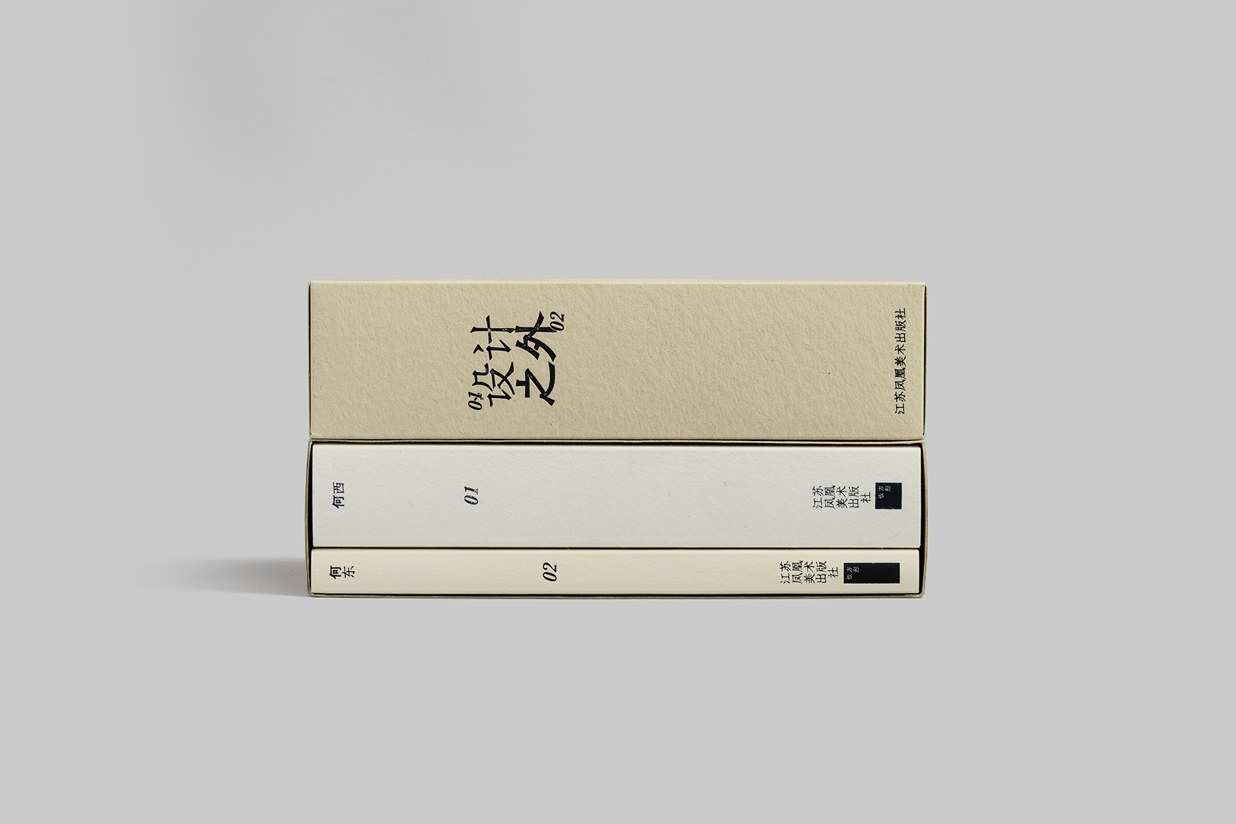
書籍封面由兩種不同肌理的本白色紙張組成,
書名和內文的利用兩種字體混排,
配合燙印的工藝產生隨機的斑駁感,
又因為人工操作而造成每本書都略有不同,
有壹種脫離古典的強烈個性,
卻又呈現出不同的狀態。
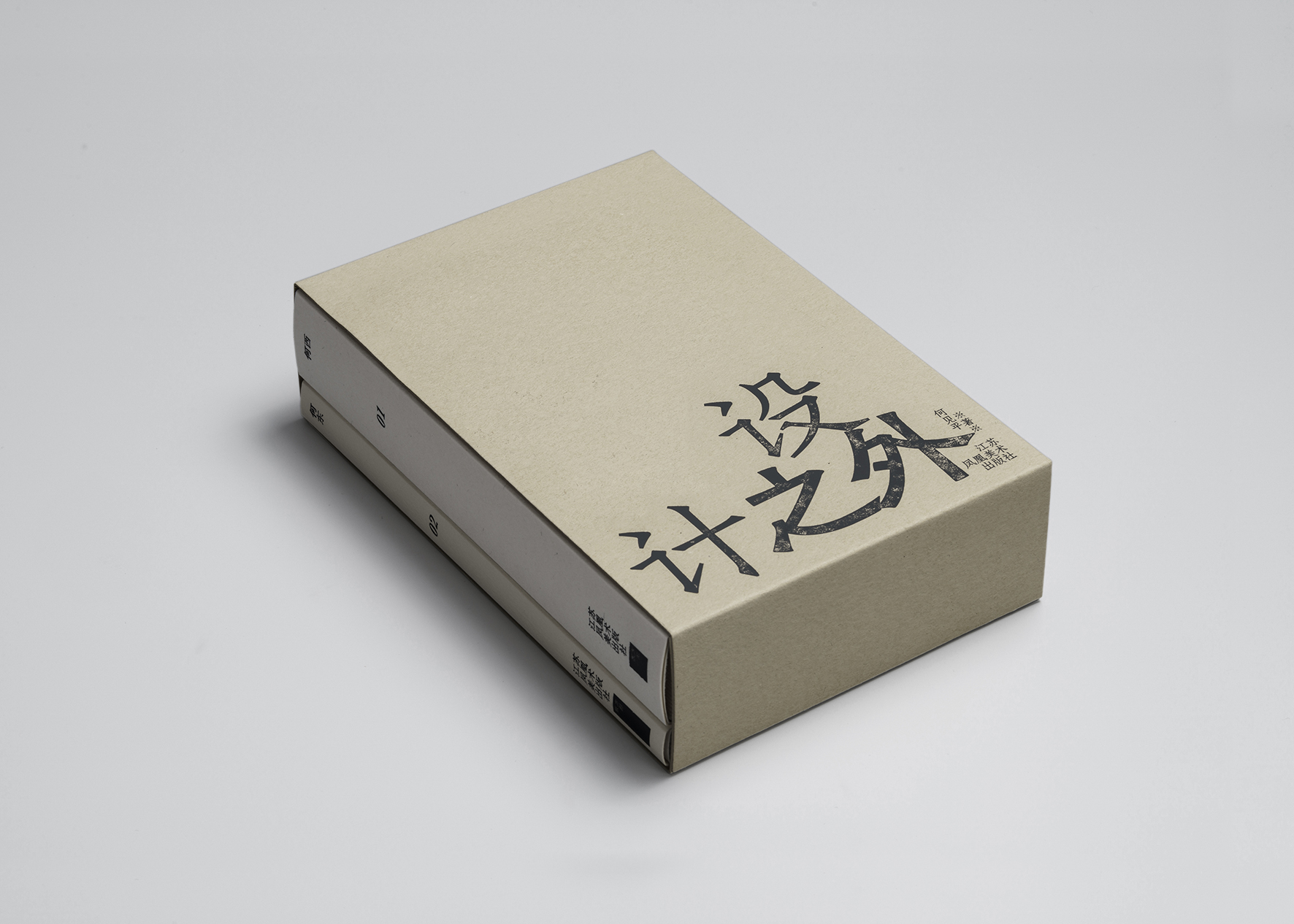
書名為《設計之外》,
兩種紙兩種字體等等都隱藏著設計者對邊界與融合的思考,
除此之外,內頁隱隱印有白色專色的固定框,
也在時刻提醒邊界的存在,
而文本卻遊走在邊界內外,
如同每個人與他們的生活壹般。
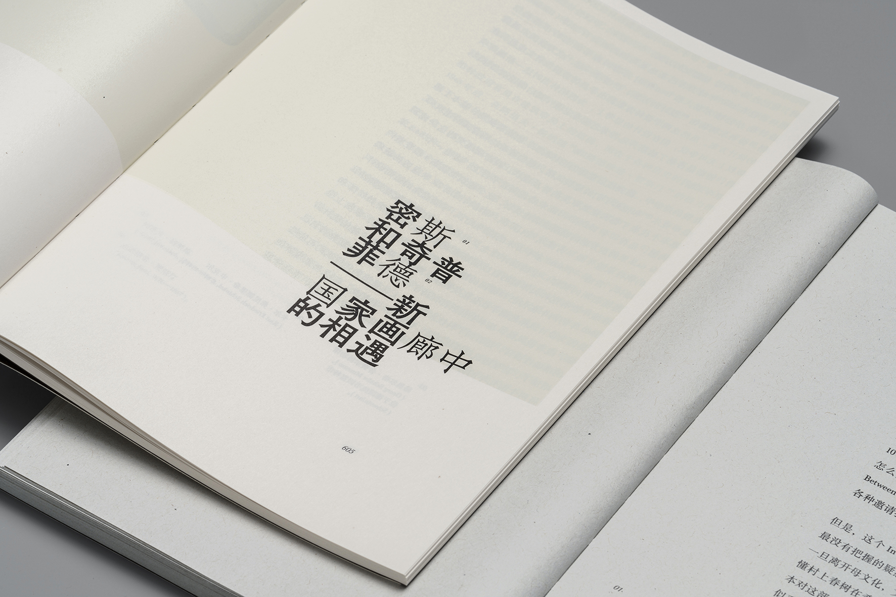
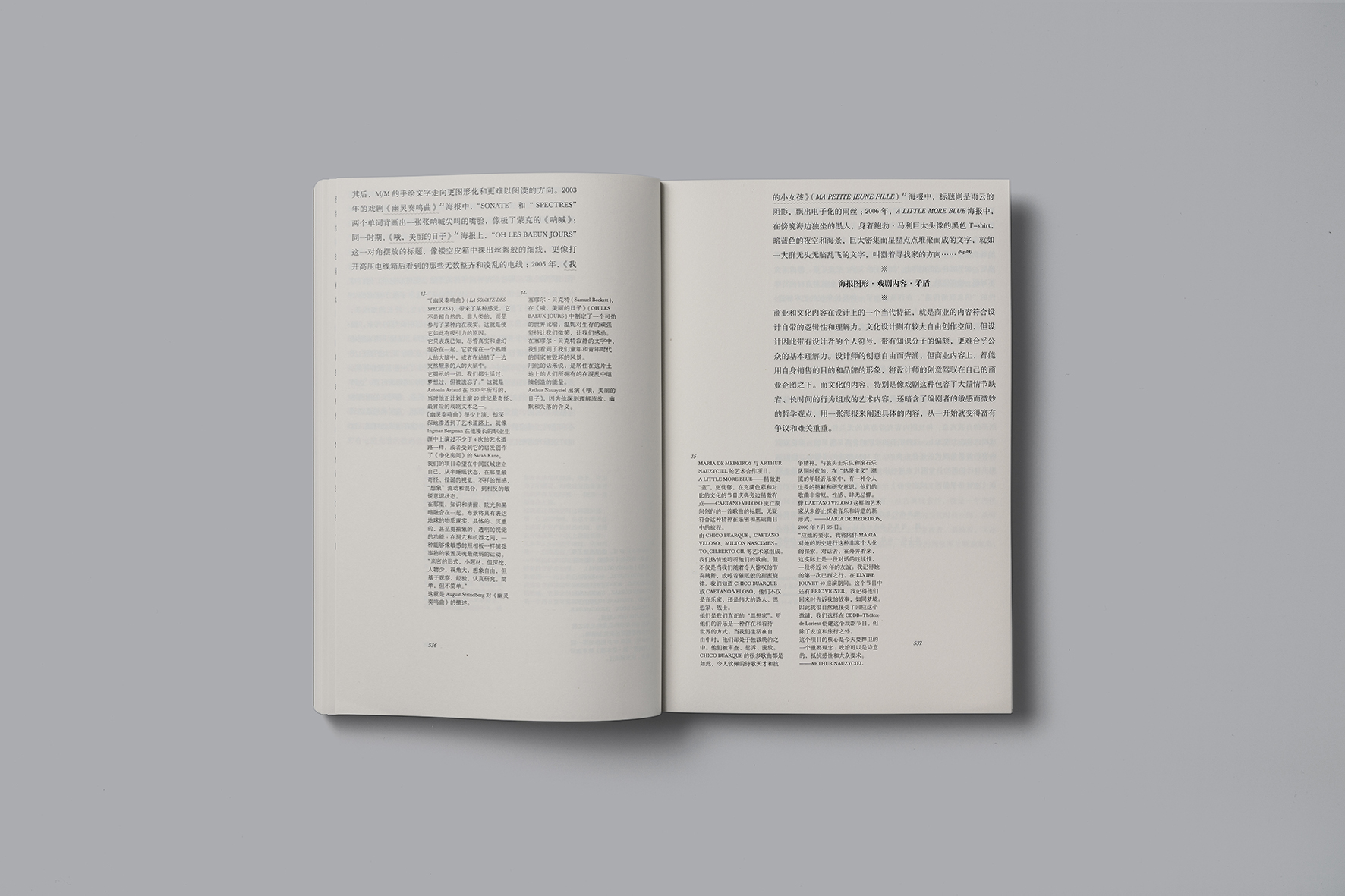
書籍內文的版面既有學術類書籍的書卷氣息,
又因大量的留白而靈動,使閱讀變得輕松愉悅。